With bright punchy colours, sharp animation, and snappy editing, Spider-Man: Into the Spider-Verse sucks viewers into Miles Morales’ wild ride from the get-go. It’s no surprise that this Marvel-lous feat of animated glory has clocked more than $350M worldwide and scored several industry awards making it Sony’s leading animated title. It has changed the landscape for future animated films.
CG Spectrum caught up with Sony Pictures Imageworks’ Supervising Animator Jeff Panko and Lead Lighting and Compositing Artist Geeta Basantani to talk Spider-Man animation. We discovered just how this bold look was developed and the challenges that came with breaking new animation ground.
The signature style of Spider-Man: Into the Spider-Verse
Spider-Man: Into the Spider-Verse consisted of more than 2,600 shots; bigger than a regular animated movie, and unimaginably more complex.
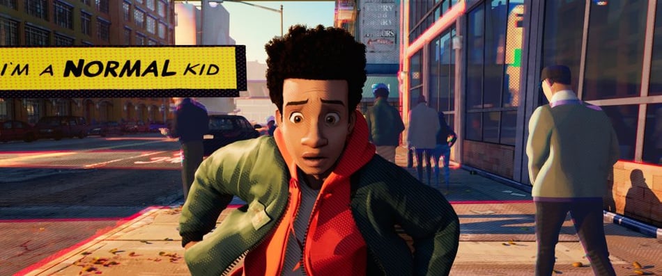
“No one has ever done anything like this before,” says Geeta Basantani, who worked on the first shot of the movie through to the very last. Geeta played a major role in developing the stylistic choices used throughout the Spider-Verse. “The Art Directors were very bold. We were just going for it.”
With around 800 people working on the film, there was a delicate balance between individual creativity and overarching consistency. In order for the movie to work, everyone had to be on board with the fundamental style.
“Sony had teams for every sequence, so I went on every team to help them understand the language of the movie,” explains Geeta. “There’s this balance of needing to keep things consistent, but we didn’t want to shackle creative people.”
“What they [the film’s Directors] wanted was the individual hand of the animator to be visible in every shot,” explains Jeff Panko, who entered the Spider-Verse in August 2017. “So there wasn’t a hard rule for anything. You could do your own artistic pass.“
Getting the animators to speak the same Spider-Verse language
While artists were encouraged to inject their own creative spice, sequences still needed to flow seamlessly from one to the other. So to get everyone on the same page early on, the team developed a very intentional style language of light, colour, hatchings, lines and dots.
“For example, light and reflections were defined by dots, and all of the shadows were lines. And they go thick and thin. If you zoom in, there are dots everywhere. On a small scale you don’t always see it,” explains Geeta. “We were against glow. There’s never a ‘soft glow’ moment in the movie. So when you see the train lights coming closer, all the ‘glows’ are visually designed with dots that go from thick to thin.”
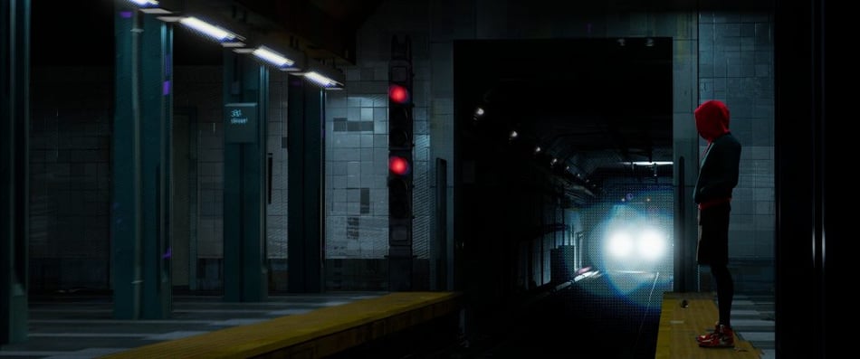
“There were different standards for every type of light,” she continues. “There’s a particular style for a lamp versus a big source of light. Whenever the sun hits the street, for example, you see this red fringing. It’s called a fringe treatment.”
Every detail in the movie was deliberate. And with each Spider-Person bringing their own visual flavour, it was vital to set style standards for each character. For example, when Spider-Man was around, reds and blues were more prominent.

If you paid close attention, you would have also noticed: “There’s geometry floating on surfaces, and real lines which you’ll see floating in 3D. The modelling was done that way, it was offset a little bit. And then floating textures were added here and there. Like if it’s a boring wall, we’d float a texture on it,” says Basantani.
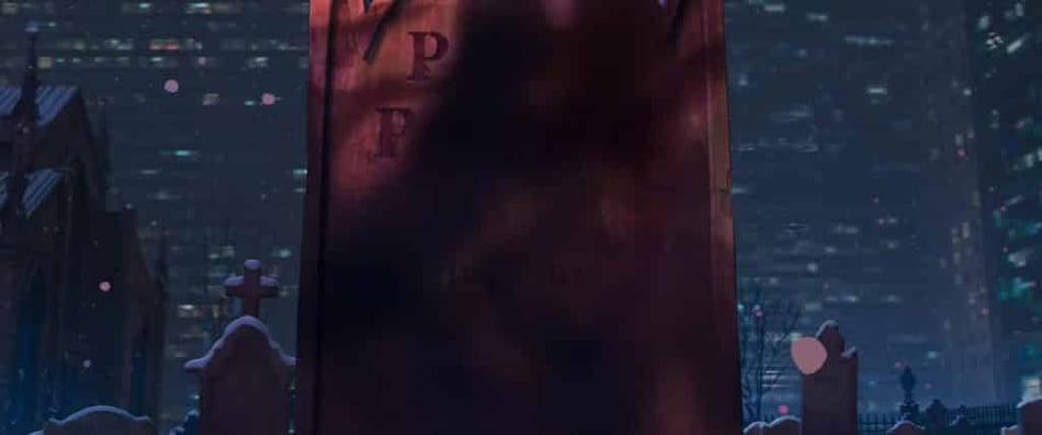
Consistency was a struggle, especially early on when the language was still in its infancy. Panko recalls that initially some artists were overdoing the smears and ink lines, for example. In that case, Josh Beveridge, the Head of Character Animation, made the call that smears and ink lines looked really good for one, maybe two frames, but any more than that would overtake the animation and become distracting.
Sample shots provided the artists with a sense of what would or wouldn’t work. “Once there were enough shots, you could say to an artist: Your idea is good, just pattern it after this shot,” adds Panko.
Making the decision to ditch motion blur
Undoubtedly, part of the film’s visual appeal came from a very specific decision early on to not use motion blur in the movie.
“There was no motion blur,” says Basantani. “It seems like motion blur but it’s actually ‘shifting’, which is basically taking the same image and repeating or stepping it, echoing it in fact. It’s an echo treatment. Stepping it like that gives you an illusion that it’s motion blur, but it’s not. It’s sharper.”
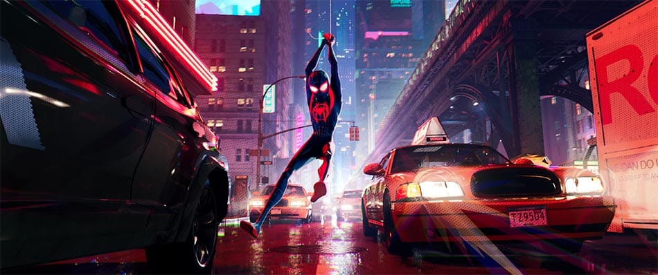
Implementing the 'stepping' technique
Traditionally, the illusion of movement in film (which runs on 24 frames per second) happens when each frame has a different image and they are viewed consecutively. In animation, if each frame contains a new drawing, you’re animating “on ones”. But Spider-Man: Into The Spider-Verse “was done primarily on twos, so we would hold every second frame,” says Panko, as he begins to describe the challenges of animating on both ones and twos.
“Usually when you animate on twos and try to pose every second frame, you can tell it was posed on every second frame; it doesn’t have a nice flow to it. Personally, I found it best to animate the shot on ones, and go through, bake everything out, and delete every second key and step it.”
It took countless hours of testing and experimenting to get the look right, and several custom tools were built to support the artists in the process.
One such tool allowed artists to animate their shots in the traditional way, but a play blast would output every second frame, giving it the ‘stepping’ effect. This came in handy for dailies.
Another obstacle to overcome was having animation on twos and what that meant for the needs of the hair and cloth department. Jeff explains: “With regular animation you can get by on twos. But hair and cloth need to simulate on ones, because otherwise it jumps all over the place. So it was way more involved than just animating straight ahead.”
“In the publish process, we’d have these different checks: like do you have step keys on every control on every frame? And if you have some frames that had step keys, some that have spline keys, your publish wouldn’t go through because it’s not usable by hair and cloth,” he adds.
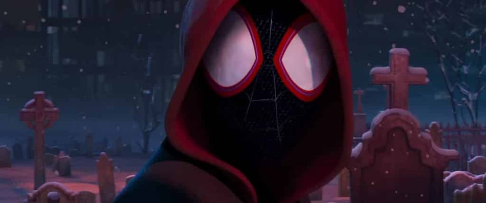
Another neat trick up Sony’s sleeve was the Ink Line Tool, which allowed artists to do strokes in Maya that replicated a comic book artist’s pen hatching or smears. “You could actually draw the stroke, and it would create a hierarchy on the stroke,” says Panko. “It would then create this chain of controls, so once you created a stroke you could go in and move the controls to pose it.”
This tool was developed after some serious trial and error. Jeff explained that occasionally artists were adding strokes, which worked in 2D space to camera, but the Stereo Department required that they exist in proper 3D space. Once they realized their strokes wouldn’t translate to 3D, some of the stroke work had to be redone.
Pushing the creative limits of animation
Despite the challenges, the film came together impeccably. Thanks to the creative vision and boldness of the film’s directors, and the many hundreds of talented artists who added personal touches, Spider-Man: Into The Spider-Verse has undoubtedly left its mark on the animation world.
“Even before I was on the show, I saw all the concept art and thought, “Man, if we could get it to look anything like this, it’s going to be amazing!”” says Jeff. “The lighting and comp teams pushed so hard to make it look like the concept art. I think it was pretty much spot on.”
For Geeta, Spider-Man: Into the Spider-Verse is a definite career highlight. She offers her encouragement to future animators and compositors: “I remember watching Spider-Man with my brother. He was my superhero growing up. I really wanted to work on Spider-Man. I did work on a couple before this, but then I got the chance to work on one of the most amazing ones. It’s a childhood dream come true, even if it took 20 years. Don’t give up. Keep aiming.”
Did the Spider-Verse inspire you to become a 3D Animator?
If so, check out our beginner and advanced animation courses! CG Spectrum is an online school for animation that teaches the job skills studios are looking for. Small class sizes taught by award-winning mentors prepare the next generation of superhero-loving artists to go forth and create spectacular movies and games for the world to enjoy. Curious? Hit the button to learn more!

Related Links

