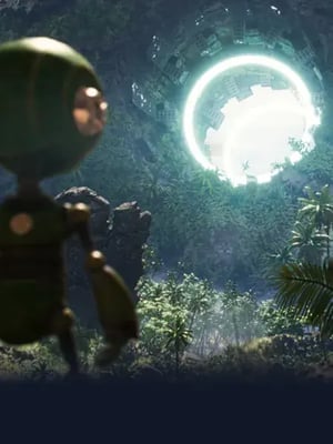
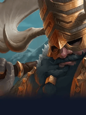
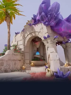
Oliver Harbour tolerated his retail management job, but it didn't fulfill him. With a love of sci-fi and fantasy, he decided to pursue a career in the film and game industry where he could explore these realms. So, Oliver enrolled in CG Spectrum's Digital Illustration Specialization Course.
Before even graduating, Oliver scored his first freelance gig based on work he produced in class! Now he's working full-time as a freelance illustrator and has created art for clients including Marvel, Upper Deck, and Monumental.
Digital Illustration Specialization Course Review
We asked Oliver to review our Digital Illustration Specialization Course for anyone else thinking of starting a career in digital painting.
Why did you decide to enroll in CG Spectrum's Advanced Digital Illustration Specialization course?
I found CG Spectrum while looking for online courses, and I figured it was too good to be true, but I’m so glad I joined the CGS family.
My mentor, Eric Wilkerson, and the amazing curriculum were a big draw. Eric has worked for some incredible companies like Disney, Weta Workshop, Marvel, and—the most notable to me—Wizards of the Coasts, the studio responsible for Magic: The Gathering (MTG).
"I wanted to learn from industry professionals, study in a small group, and be able to complete the coursework around my full-time job (at that time). CG Spectrum ticked every box and more; the course structure worked perfectly for me."
A few years back, I lost my mum to a brain tumor, and it was a slap in the face at how fleeting life can be. So I figured I would follow my heart and find my path back to an art career.
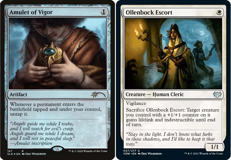
Magic: The Gathering card art for Wizards of the Coast by Oliver's mentor, Eric Wilkerson.
To paint fantasy illustrations for Wizards of the Coast has been a lifelong goal, and here is an opportunity to learn from someone who has!
The curriculum covered many topics from cinematic storytelling, lighting and color theory, trading card and gaming art to illustrating book covers. Not only did I learn advanced techniques, the final term was all about getting ready to venture out into the big wide world of freelance work!
Please explain a bit about your role as a freelance illustrator.
It will probably be easier to tell you how I got my first gig and how things have developed from there. This past year has been crazy! Firstly, I never expected to jump into freelance work so quickly, not that I’m complaining at all!
Luckily I had a great support network behind me. Not only did I have my mentor Eric and the kind of knowledge and connections he possesses, but I also had an entire online community willing to answer any of my questions about the industry. CG Spectrum also has dedicated career development services which helped me with my CV and interview questions.
"The whole CG Spectrum experience made me feel like that scene in Avengers: End Game when Dr. Strange opened all the portals for the allies to come through — everyone had my back."
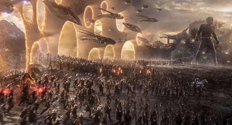
Still from Marvel's Avengers: End Game portal scene.
Quick side note: when I first started out trying to get into the entertainment industry, it was as a concept artist. That was the name bandied about and given—mistakenly in a lot of cases—to roles (and artists) in the entertainment industry that I tried to get into. I failed.
Eric gave me the guidance and confidence to pursue the role of a digital and traditional illustrator. It was illustration that made me tick much more than the concept art box. I can get bored (well, more distracted) drawing the same battery prop or asset 150 times, all with slight variations.
With an illustration, I feel I can really sink my teeth into that one piece, plow all my efforts into its narrative, and dial in an emotional response from its audience. Don’t get me wrong, I still work on and enjoy concept art, just nowhere near as much as illustration. (Read more about the difference between concept art vs. illustration.)
It was during my second term at CG Spectrum when I got a message from an art director on social media saying they liked the work I had produced under Eric's mentorship in my first term. They wondered if I would be willing to do some pitch art for them!
Mind blown, I said yes, and decided to quit my full-time job. This was my jump-off-a-cliff moment. I couldn’t wait to start working on the project! It's worth mentioning that I had the support of my family to do so, as I knew it was a risk, but I had to follow it with hope.
"During my third and final term at CGS, I was approached by an art director at Upper Deck. They commissioned me to do some Marvel characters, which was amazing!"
It was at this point that I felt the wind catch under my wings. I wasn’t just falling off a cliff; I was learning to soar on the winds. It was a thrilling moment, wrought with emotions of joy, doubt, and excitement.
Then the next opportunity came sooner than expected. I received an email from an art director at Monumental asking if I would work on their game Mythgard, and that was the start of my journey!
I am still learning how to juggle freelance work—the ebb and flow of contracts and quieter times—but I wouldn’t swap it for in the world.
You recently met up with your mentor, Eric Wilkerson, in the US.
Eric is a true gent, an all-around lovely guy who will give you honest, clear feedback and truly wants you to succeed. We had a class session once a week to go through the previous week's assignment, however, there were plenty of opportunities to push your work further. The weekly class sessions usually last around an hour, but Eric was thorough in his critique!
"Having Eric and peer reviews of your work in a mid-week feedback group session were two things I found invaluable. If you put the effort in, you’ll reap the rewards!"
And what a treat to see my CGS friends and mentor in person this year! It was a trip I’ll treasure for a lifetime. We decided to all meet in Philadelphia at the Imaginative Realism Conference, known as IX Con.
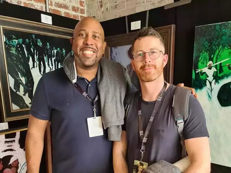
Eric and Oliver met in person for the first time in October.
IX Con is incredible, and I highly recommend anyone to go at least once to see the crème de la crème of sci-fi and fantasy artists from around the world.
Term 1
Share one piece of work you completed in this term and describe your process.
In term one, we were tasked with painting a single-figure portrait. We were given the brief as if it was for a client to paint a character portrait for a new novel, Confessions of a [student to fill in the blank] War Veteran. I discussed with Eric and chose to do a more Magic: The Gathering card art style piece, as this was where I wanted to focus.
I made up a character called Tili, who was an assassin. The story behind the image is that the Dralmaki Scroll of Atonement makes you relive the pain you inflict upon others and exacts the scars upon your flesh. It is part of her order to document every attack and slice she has made to another.

To get us used to client work, we were expected to treat Eric as if he was our client and go through the typical client process. With this in mind, we started our paintings as a small grayscale thumbnail, which got worked up into a rough sketch and a color rough for approval. Once the client (Eric) was happy with this, we moved ahead to the final render after gathering appropriate reference and anything else we would need to complete the piece.
What new skills did you acquire?
How to effectively gather and use relevant reference was a key thing for me. I used to find reference that was kind of similar to my idea and then tried to make my image work with the reference rather than having them work for me. So, having a friend model specifically for my illustration and taking pictures for reference was key to this piece.
What challenges did you face?
Rendering materials and getting my lighting to pop were my main challenges. Getting that evening glow to the shaft of light hitting the floor behind her was tricky. Of course, looking back on it, there are still loads of things I would tinker with!
Timelapse of Oliver working on his first term project, Tili's Atonement.
What was your main takeaway?
Patience. And if in doubt, "Dutch it." My first thumbnail was far too parallel, and it really killed the flow of the piece, so I ended up putting the illustration on a Dutch angle and framed her with a darker background, which helped the flow and added needed movement to the piece.
If you could change anything about this term, what would it be?
It’s hard to say if I would change anything because it was all such a steep learning curve. I guess I would have taken more time to reflect on what I was doing rather than plowing through the painting process.
Any advice for students starting term 1?
Never be married to your work. When I started out, more often than not, I didn’t like what I produced. It's less common for me these days, but it’s still a battle I think a lot of people have with their own work. When I found a piece that worked better than another, or a certain part of an image was good but didn’t work with the rest of the image, it was hard to let that go, especially when you had someone telling you, "Yeah you need to redo this entire side, or character, or start over." It was crushing.
"It’s important to remember that feedback and critiques are not a personal attack, they're not directed at you."
Eventually, you learn to go, "Yup, I see exactly what you mean," and move forward with your work and learning. Failure will be your greatest teacher, just make sure you learn from your mistakes and you’ll be grand.
Term 2
In this piece I completed for term two, Beowulf is fighting Grendel's mother, reaching for the magical sword that he can use to finally defeat her. This is the first piece I utilized some 3D in my painting process of 2D-3D-2D.

Beowulf by Oliver.
Like most paintings, this started off as a rough thumbnail image of many. Once I was happy (and Eric was happy) I moved on to gathering reference material and color schemes that I liked. However, after not being satisfied with the reference I collected, I started to tackle 3D in Blender and made a crude block out of the scene.
Eric teaches you how to pose characters in other 3D software, but I took to Blender quite intuitively.
"Using 3D software (Blender) helped a tonne with lighting and perspective for this piece. Then for the final touches, I took my own reference pictures of hands, faces, and metals to get the finishing touches I wanted for the painting."
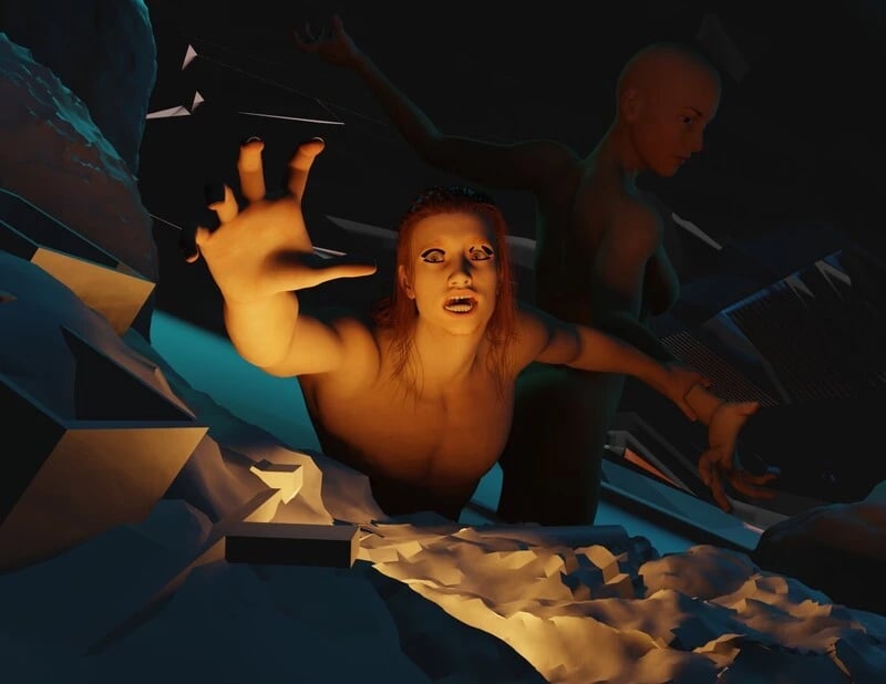
Oliver's initial block out of Beowulf in Blender.
The main skill I acquired this term was definitely using 3D in my work. I had never really considered using it or realized how accessible it was to artists. Composition and storytelling were the next on the big learning curves — if you have to explain what is going on, your painting's narrative isn’t strong enough.
The main challenge I had with this piece was getting the flow of the piece to work. This was accomplished with the direction of the tentacles and the placement of certain key points in the painting's story, such as the hands, weapons, and the expressions of the characters.
"My main takeaway from term two is that if you’re going to use 3D as an aid, do just that, and don’t let it rule your painting. You’re in control of the painting, so if something isn’t working, you have the opportunity to explore other routes to a better image."
I changed the hands and the position of the sword so many times. If I had kept the sword in its original position, which was much lower, it would have looked like Beowulf was reaching out for gold coins. What good would that be in a fight?
Oliver's work-in-progress timelapse of Beowulf.
The key thing that changed for me in this term was drawing on a screen, not a tablet. I previously used a Wacom tablet, but I found the disconnect between hand-eye coordination really jarring. I painted my Beowulf illustration on Procreate on my iPad, which I still love to use. I finally saved enough to get a Wacom screen a few months later, and it was a game-changer for me. I love Procreate, but Photoshop was where I was most comfortable painting. So yeah, I wish I had a screen to paint on earlier!
"My main advice for students starting term two is don’t forget what you learned in term one! As there is so much to learn and take in, it was easy not to carry your learning from the last term into the current one because you are covering new topics!"
Go over the term one curriculum again, but at a slower pace, just to keep your mind refreshed.
I also suggest you read or have an idea what Beowulf is about and make a list of trading games or marketing art you admire and would like to create, as it will help you.
Term 3
My term three piece is of Baba Yaga but in the style of Blizzard’s World of Warcraft Blood Trolls. I was trying to build a portfolio aimed toward MTG, so I painted it with this in mind.

Baba Yaga digital illustration by Oliver.
I started by looking up some initial concept design work by Gabe Gonzalez, then decided how I wanted to push her design to fit with my interpretation of Baba Yaga as a Blood Troll.
Like my other assignments, this whole process was geared towards working with a client, so we went through the stages of thumbnails to get composition, sketches, and color-key sketches until it was approved.
Once the idea was fairly concrete, I moved into Blender to build a basic background. I sculpted the cauldron base in ZBrush and posed and lit the scene and model in Blender. Once I had a base to use as reference, I went ahead and started painting.
My biggest challenge was working with the 3D integration and trying not to make it rule my painting. Once you spend so much time in 3D, you can easily build up so much detail relatively quickly, and the challenge for me was letting go of swathes of detail to let the painting talk.

Baba Yaga concept art.
If you imagine your painting is a large room and the detail is small groups of people having conversations. They are telling a different part of a story, and your eyes are a person walking around listening to those separate conversations. You need breathing room between the groups to walk around and feel comfortable. Now imagine the room became filled to the brim with people talking at the top of their lungs. You can’t hear any one individual conversation, and it’s overwhelming. Doesn’t seem so comfortable anymore, does it? So learning this balance was a big thing for me.
"My main takeaway from term three is that less is more! This also applies to edges. It's a hard lesson; I wanted to show everything and not let the viewer miss a thing. But that can be too much, and people get exhausted looking around the painting."
Having areas for the eye to relax and simplified shapes that hint towards an object, rather than having every detail shown, helps achieve this. Lost edges allow the mind to fill in the gaps and give a sense of depth that a crystal-clear image doesn’t allow.
If I could, I’d find Hermione Granger, hit her over the head, and steal her time-turner. Ha, no, seriously, I would.
"There was so much to take away from this last term. It really gave me the confidence to take on contracts with big companies, believe in myself, and realize that I had a real chance of understanding the business side of being a freelancer."
Learning to draw is only half the battle; the other is learning to treat yourself and your art as a business.

Baba Yaga concept art.
So by now, you will understand how the curriculum is structured and see there are basic and advanced instructions for you to follow. I highly recommend you go through the advanced instructions every time, as these will push you that little bit further and enlighten you that little more.
"As term three draws to a close, don’t panic that your time is coming to an end with your tutor. Your journey has only just begun! It’s an emotional time—embrace it. Above all else, enjoy yourself."
Also, go get a book called What They Don’t Teach in Art School by Will Terry. It’s amazing. It was released while I was studying digital painting and even my mentor said to go grab it!
To see more of Oliver's work, head to his website and follow him on LinkedIn, Instagram, and Twitter.
Study digital illustration and learn how to work successfully in the creative industries.
You'll learn character illustration techniques and create a range of narrative artworks for client briefs. Explore various commercial markets and learn about creating book covers, card gaming art, and marketing art for film and games. Experiment with hand painting, photo-bashing, and 3D paint-overs.
Whether you want to work in film, games, or book publishing, our career-focused courses prepare you for an exciting career in your chosen field.
Related Links

