Throughout your art journey, you’ll continually return to the fundamentals of art, which act as an artist's building blocks. No matter your style or medium, certain core principles will always remain at the center of what you create. In this article, we’ll dive into the six key fundamentals of art that every artist should know and how they shape careers across different creative fields.
Ready to improve your art? Let’s break down the art fundamentals that will help bring your creative visions to life.
What are the 6 fundamentals of art?
The six fundamentals of art are the "rules" artists generally abide by. Each rule or component — anatomy, perspective, form and structure, lighting and shadow, color, and composition — will contribute to the overall visual impact of your artwork. Through their interactions and intersections, an artwork comes together with a required level of realism and expression.
Anatomy
Understanding anatomy is essential whenever drawing humans, animals, or plants. Being able to ascertain how the human body works, its proportions and joints, etc., helps you illustrate, sculpt, or animate more realistic poses and movements, such as walking, jumping over a fence, or picking up an object from a table. The same goes for understanding animal and flora anatomy if you want to create art that includes animals and/or plants.
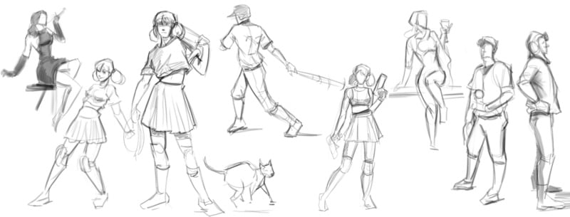
Examples of the sketched human and animal form by Digital Illustrator Specialization grad Jessica G, which she worked on during CGS's free extracurricular figure drawing sessions (one of the many perks of studying with us!).
Perspective
Artists use perspective to make a two-dimensional image (drawn on paper or a screen) appear as though it has three dimensions. For example, perspective rules state that objects get smaller as they are further away from you. So, for example, if you’re drawing a speaker's perspective on a stage while speaking to an auditorium, the front row of chairs will be the biggest, decreasing in size as you progress to the back rows.
When using fundamentals of perspective, you may use one of the following in your compositions:
- One-point (or linear) perspective: Creating one imaginary “vanishing point” where all objects converge.
- Arial (or atmospheric) perspective: Objects in the background decrease in contrast, saturation, and detail to simulate the distance from the viewer’s eye.

This Blender environment paint-over by Concept Artist Specialization student Gwen T is a great example of perspective, using a decrease in contrast and saturation to denote buildings in the distance. (Not ready to take an advanced course? We have beginner concept art courses to get you started!)
Form and Structure
At their core, all objects comprise a mixture of basic shapes — squares, circles, and triangles (or in three dimensions: cubes, spheres, and triangular prisms). Form and structure help flat drawings appear more realistic and as though they occupy space in width and depth.

Think of early artist sketches for animation storyboards. The artist usually uses a cylinder and a sphere to represent the character rather than drawing out every curve of their body. Then, in subsequent versions of their storyboards, they begin superimposing more realistic human features, using these basic shapes as a foundation.
Concept art and illustrations usually start as a series of basic shapes in early sketches or drafts before adding details and definitions to give their work a more recognizable form.
Timelapse of a sketch by Concept Artist and CGS mentor, Tyler James, which shows him starting with a simple circle shape. What other shapes can you see used?
Lighting and Shadow
Another way to make flat objects on a page or screen look more realistic is to apply concepts of lighting and shadows to your depictions. In animated art forms, how the light hits a character or object and where its shadow hits can also simulate the movement of an object or character or the perspective of the viewer's eye.
Lighting and shadows are intimately connected. For example, a light on an object will cast a shadow behind it or on the opposite side of what’s being illuminated (such as a lamp hitting one side of a character’s face). Digital painters can use lighting and shadows in their coloring to show more realism and perspective in the drawings and to insinuate certain moods or themes.
Short tutorial by Love Life Drawing on shading and lighting.
Color
The final fundamental skill in art is mastering color. This includes both the color choice and the psychology behind your chosen colors.
Traditional and digital artists should know the basics of mixing colors, which includes understanding the color wheel and how to get the exact shade they want to be able to replicate real life or set the tone or mood for their work.
Color theory can be broken down into three main categories:
- Hue: It's where the shade is on the color wheel and can help set the overarching theme of an artwork.
- Saturation: The level of intensity, vibrancy, or richness a color has.
- Value: Refers to the lightness or darkness of a color, which serves as an indicator of how much light the object absorbs or reflects.

Digital illustration by CGS student Raphaelle B, which uses green hues and pushes the saturation higher on the ghost dragon to great effect.
Composition
Composition is how you arrange and combine different elements in your artwork, including lines, shapes, color, values, space, structure, and textures, and how they all work together to produce an overall look or effect. Composition can apply to all art forms — from music, writing, photography, illustration, animation, and VFX compositing.
Here are some art rules or guidelines you might consider for your composition:
- Rule of thirds: Imagine your work is divided into a 3x3 grid. Where the lines intersect should include the focal point of your composition. This also helps ensure your composition is not too symmetrical (unless you want it to be).
- Simplification: When specific realism is not necessary, you can use the concept of simplification. For example, if drawing a crowd behind a main character in an animated film, the background characters don’t need to be drawn with minute details like your main character. They can be drawn like silhouettes in the shape of people.
- Rule of odds: Physiologically, things in odd numbers look more realistic than even numbers. This means that drawing a flower vase, including five flowers rather than four, will give it more realism (at least to our brains).
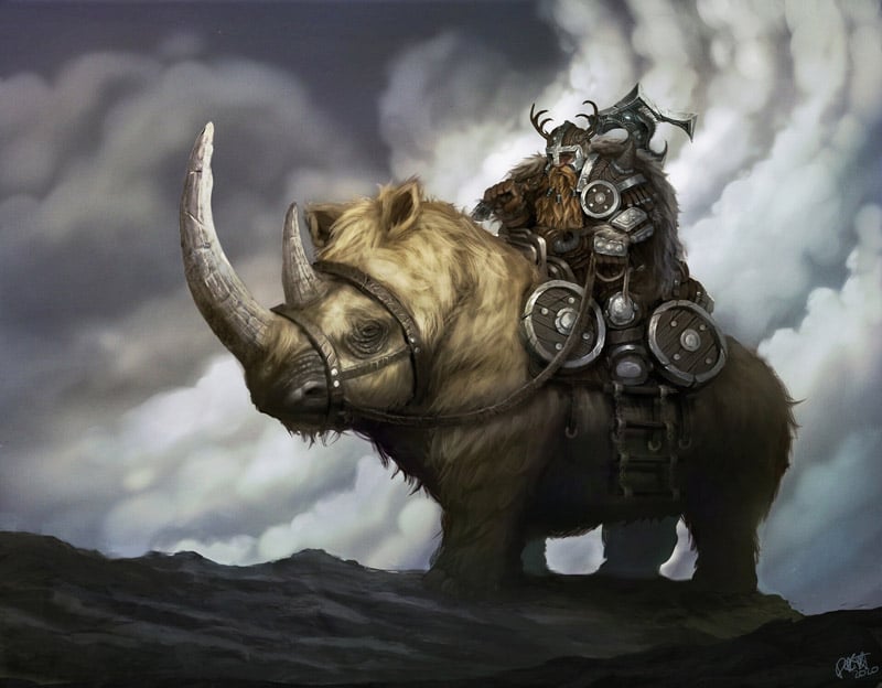
Concept art by CGS grad Danny M demonstrating the rule of thirds.
Why you should learn the fundamentals of art
If you're pursuing a career in art, knowing the fundamentals of art will apply to nearly everything you create. Think of the above six art fundamentals as the laws of physics for the creative world.
The fundamentals of art are principles that will apply to your work, no matter your medium. While some art will deviate from these principles, generally, these are the non-negotiable elements of characters, props, environments, and narrative expression in artistic works.
The fundamentals of art are helpful when studying many art forms, including digital illustration, concept art, 2D animation, 3D animation, and 3D modeling.
Check out some of CG Spectrum's recent student coursework and see if you can identify the six fundamentals of art in their work.

Book cover illustration by award-winning artist Eric Wilkerson. (Want to learn more? Read Eric's article on the five stages of digital illustration.)
Which career paths can you choose from in art?
Here are four examples of how you’d apply some of these art fundamentals in different types of art:
- Digital illustrator: A digital illustrator creates original images to form a narrative image that tells a story, conveys a mood, or sells a concept or product. There are many different types of digital illustration, but no matter which career path you pursue within digital illustration, you will be required to have sound working knowledge of the six art fundamentals.
- Concept artist: Concept artists illustrate concepts for characters, environments, and other creative assets. They require good knowledge of light, color, perspective, and anatomy to best convey their creative vision (or the creative vision of their creative director).
- 2D animator: 2D animators create movement and animations in a 2D space, so knowledge of anatomy and how the body moves is imperative. Good composition and lighting/shadowing skills are essential in this limited environment. Another essential skill is perspective, which helps create a feeling of depth and maintain focus on the foreground characters and elements.
- 3D animator: While you don't need to know how to draw to be a 3D Animator, the fundamentals of art still come into play. 3D animators create digital objects and provide the illusion that they’re traveling through a three-dimensional space. A solid knowledge of anatomy is essential for 3D animators to understand in order to be able to manipulate their characters or creatures in realistic ways that will resonate with their audience.
Apply the six fundamentals of art to an expert-led course at CG Spectrum!
Employing the fundamentals of art, CG Spectrum's digital painting courses provide students with opportunities to put these vital theories into practice through mentor-led coursework using industry-standard tools such as Photoshop.
Students also get access to our career services, with support and feedback on their portfolio or showreel, assistance with resume and job searches, and exclusive career workshops and webinars featuring industry leaders.

Related Links


